SCOPE
Magazine Design, Naming, Logo Design, Visual Identity
SECTOR
Publishing Media
DATE
Q1/2022
MY ROLE
Lead Designer, Supernatural Aid
CLIENT
Foreign Publishing House, Hero of the story
PROJECT TIME
Four weeks
STATUS
Fictitious school project
CHALLENGE
The foreign publishing house had the concept for a new magazine, but was lagging the complete visual identity. This is where I could help.
The Brief
DEPARTURE
This first stage of the mythological journey — which we have designated the 'call to adventure — signifies that destiny has summoned the hero and transferred his spiritual center of gravity from within the pale of his society to a zone unknown. — Joseph Campbell, The Hero with a Thousand Faces
Once upon a time, there was a nameless new magazine without a visual identity. The hero, a foreign publishing house, must find the answers to the unknown and create a visual identity. The publisher knew the topic, the contents, and the distribution plan. They knew their WHY and their WHAT but were looking to find their HOW.
Their WHY
Their WHY described their raison d'etre: "Our magazine hopes to empower people with the vision and the tools to create a healthy planet with vibrant communities. [...Stakeholders] will leverage the ideas in the magazine to inspire shifts at every level of society."
Their WHAT
Their WHAT The new magazine would discuss our world's problems and offer potential solutions. The publisher hoped to provide their readers with a compass showing them the way forward to a better world. Topics include global warming, economic recessions, war, etc. The purpose of the new magazine is to: Provide a new perspective on current world issues, thus molding a more positive future outlook. Empower people at the grassroots level as they long for change. Provide actionable insights for people to use and pay forward.
Their GOAL
The publishing house aimed to reach 150,000 people in Canada and the US each quarter with the new magazine. They planned to sell it in bookstores, natural food stores, independent shops, and large chain stores.
Their HOW
We knew some of their HOW: For one, they wanted to change people's awareness with a haptic magazine. The publisher told us they didn't want ads in their magazine because they feared brands would influence the topics too heavily. The magazine's financial backbone was tax-deductible donations from readers, foundation grants, and funds from teachers, journalists, grassroots organizations, faith groups, and policymakers. The publishers needed to find out HOW they wanted their magazine to look and feel. Thus they need their metaphorical Supernatural Aid, i.e., a layout designer.
The True Challenge
REFUSAL OF THE CALL
The sole problem is what the machinery of the miracle is to be. And that is a secret to be opened only in the following stages of this [story]. — Joseph Campbell
The hero of this story couldn't do it without help. The publishing house needed help to develop a visual strategy and concept. Moreover, they needed help with the following:
- A visual strategy - perhaps inspired by a style board
- A name and a logo for the magazine
- A grid and layout for the entire magazine
- A cover and back cover page design
- A table of contents design
- A thorough article pages design
- Design of visual hierarchy: titles, images, body copy, etc.
- Photography and illustration
- Physical dummy paper
Enter Graphic Designer, Me
SUPERNATURAL AID
What such a figure represents is the benign, protecting power of destiny. [...] Having responded to his own call, continuing to follow courageously as the consequences unfold, the hero finds all the forces of the unconscious at his side. — Joseph Campbell
The publishing house continued the undertaking and faced all the challenges ahead. They agreed on their guiding figure toward a striking magazine design, and the project journey took off: I could supply them with an appropriate, timely, and unique design for their magazine.
The Visual Concept and Strategy
THE CROSSING OF THE FIRST THRESHOLD
With the personifications of his destiny to guide and aid him, the hero goes forward in his adventure until he comes to the "threshold guardian" at the entrance to the zone of magnified power. — Joseph Campbell
The first challenge was to decide which direction to go. I read all six articles first for the first magazine issue:
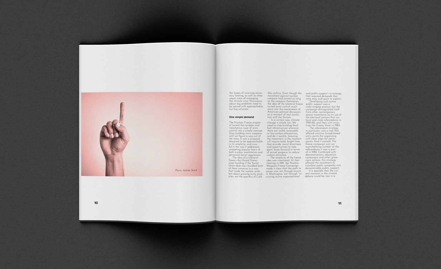
- Can We Save Our Planet? What the Climate Movement Can Learn From the Nuclear Freeze Campaign
- Staying Human in a Time of Climate Change: New Author on Science, Grief, and Hope
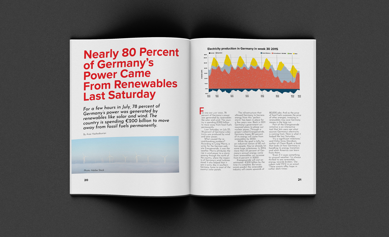
- Nearly 80 Percent of Germany's Power Came From Renewables Last Saturday
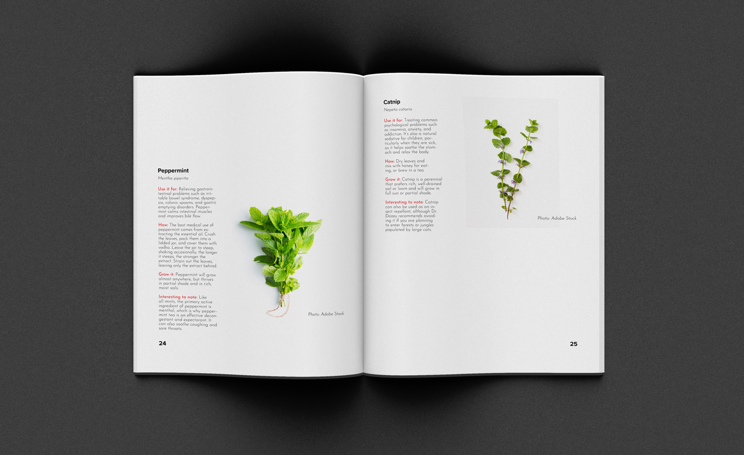
- 5 Medicinal Herbs You Can Grow in Your Backyard
- Big City Living May Help You Slow Down, Stress Less, and Be Happy. Really!
- We Aren't Alone in Our Cities: 12 Ways Animals Have Adapted to Urban Life
I took notes and jotted down words from the articles and the creative brief to develop a name for the magazine. Here are the words I worked with for naming the magazine:
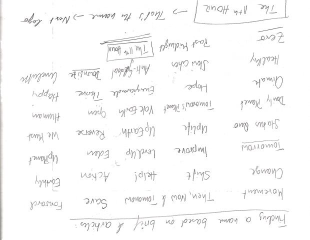
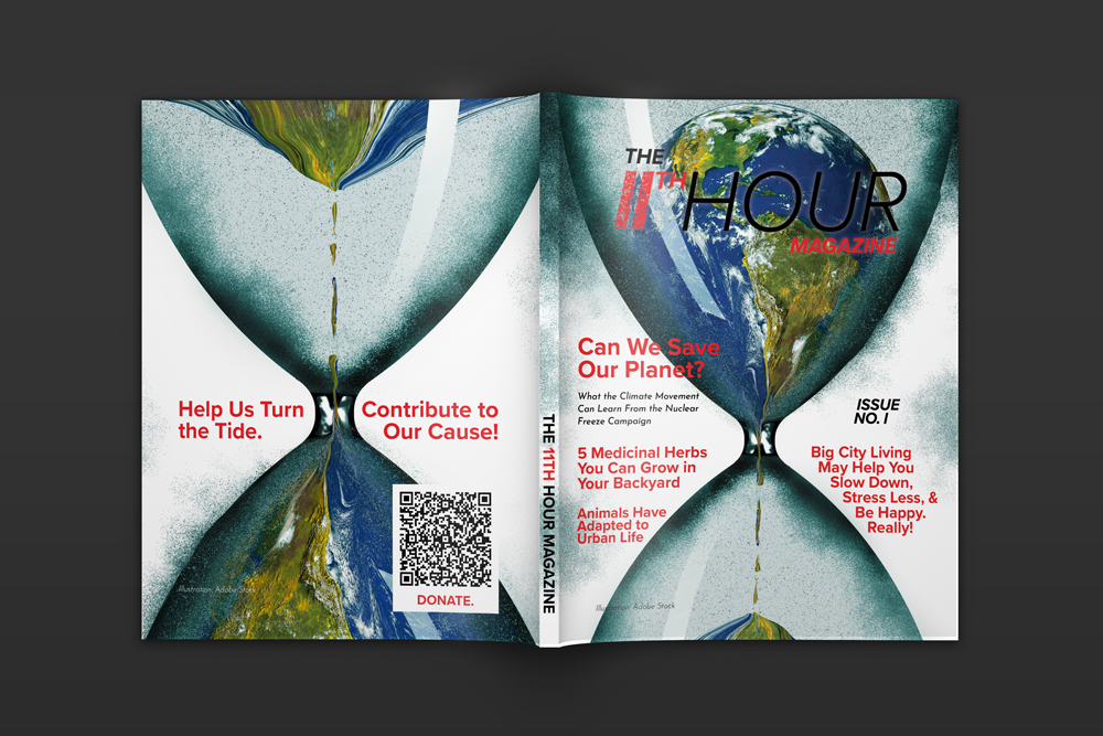
I recommended that the publisher opts for The 11th Hour Magazine as the name for a few reasons:
- The name spoke with a sense of urgency. This concept of urgency worked well with the overall idea of the content.
- The sense of urgency equipped the concept with a touch of honesty, as opposed to the utopic hopes that everything would be good. A few of the names I juggled with gave this impression. They were not adequate, so I ruled them out.
- The name provided ample options for turning it into a proper logotype, potentially avoiding the need for a smaller logomark.
We agreed, and I started sketching the logo, which is the first step toward the visual brand of the hero's magazine. These are my sketches:
Finding the Perfect Concept
The Belly of the Whale
The idea that the passage of the magical threshold is a transit into the sphere of rebirth is symbolized in the worldwide womb image of the belly of the whale. The hero, instead of conquering or conciliating the power of the threshold, is swallowed into the unknown.
— Joseph Campbell
The sketching process initiated and deepened my thinking about the visual strategy for the magazine. I imagined the logo to represent its name visually.
A very promising idea was the hourglass concept. I could have integrated an hourglass logo into the "H," but the Google search results were overwhelming for "hourglass" and "logo." I wanted the magazine to retain its uniqueness. Using an hourglass mark inside the "H" became too generic as there already seemed to be many iterations. It was perfect for the magazine's name but needed to be unique.
In my sketches, I also experimented with some dispersion effects. The most prominent snap of a finger from contemporary popular culture inspired me to this concept. Once Thanos snapped his fingers, the decay and dispersion of half of all sentient life happened. The Marvel heroes turned to dust. Thanos' dusty home planet Titan inspired the concept as well.
I had the logo concept in place, but I still had to design it digitally to see if it worked. I had to help the hero of this case story move from the known into the unknown world confidently.
The Design Process
Materializing the Concept
The Road to Trials
Once having traversed the threshold, the hero moves in a dream landscape of curiously fluid, ambiguous forms, where he must survive a succession of trials.
— Joseph Campbell
At this stage, our hero entered the metaphorical unknown world, the clean slate, the tabula rasa. Luckily our hero had entered the world with help from the supernatural aid, the graphic designer--me: I designed the publisher's new magazine from the ground up, facing several challenges.
Challenge Zero - The Target Group and their Wishes
The distribution market of the magazine is North America. Hence I opted for a letter size 8.5 by 11 inches to adhere to the market. This standard size should also keep printing costs low.
The target market is conscious of the resources that go into making the magazine. Recycled and sustainable resources are mandatory for the concept of such a magazine. The idea is to create a high-end feel at the same time.
This magazine shall attract the spokespersons of the pressing matters in focus. It should be a tool to educate and mold positive opinions towards 'turning the tides' of what we've been doing to our planet. Having striking covers with a clear focal point and a clear hierarchy for the secondary and tertiary focal points is vital. We ought to reach those goals and those people with controversial headlines, striking colors, and raw visuals. The idea is to tell people that the world is falling apart, BUT let us do something about it.
Challenge One - The Logo
I started digitizing the logo of The 11th Hour Magazine. What I wanted the logotype to do:
- Create a sense of urgency: dispersion effect, color red.
- Represent forward motion: italics.
- Contrast strong vs. fragile, prone to decay, but with hope: dispersion effect and font weights.
- Danger, attention: the color red.
- Strength and clear direction: typeface choice Proxima Nova.
I went through a few iterations, and the biggest hurdle was to connect the two "Hs." My initial idea didn't work. It seemed either odd, off, incorrect or confusing trying to combine the two:
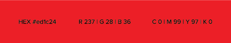
Ultimately, I took a more conservative route and superscripted the "TH." It un-complicated the logo on a potentially busy cover page. Lastly, I opted for a deeper red color than initially planned. It creates a more striking contrast with the magazine's other elements.
Challenge Two - The Layout
The name and logo are in place and give direction for the brand. Considering the brief, the contents of the articles, the magazine name, and the logo, I started planning the magazine. I created a simple macro flat plan to organize the content. It gave me a sense of direction in creating a modular grid. This macro plan would give me maximum control and flexibility in designing an organized but rhythmic layout.
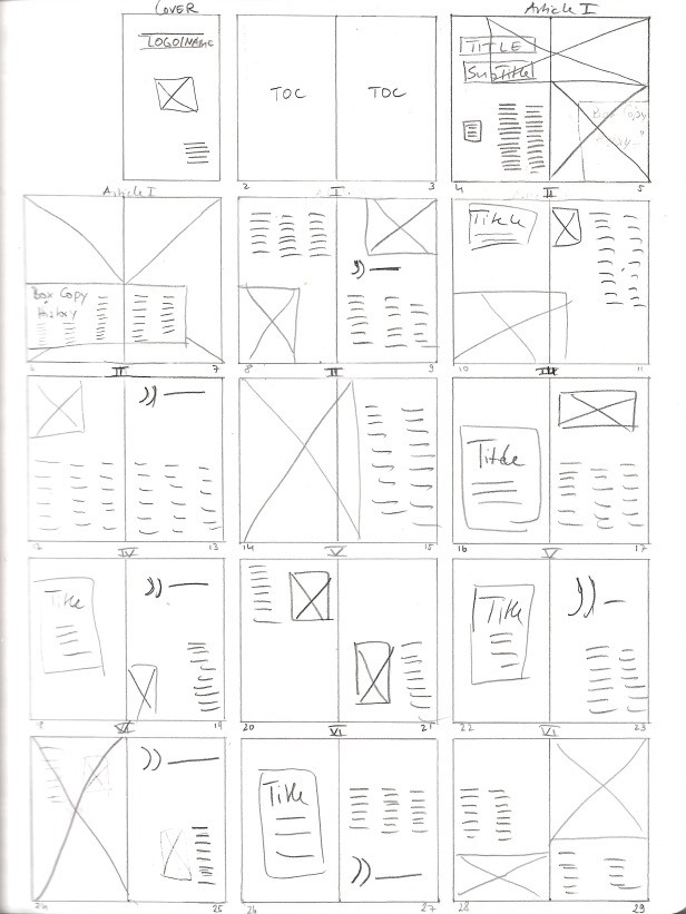
Because the publisher will distribute the magazine in North America, it will be in letter size. I created a grid with twelve columns, eight rows, sufficient margin, and a bleed of 3mm.
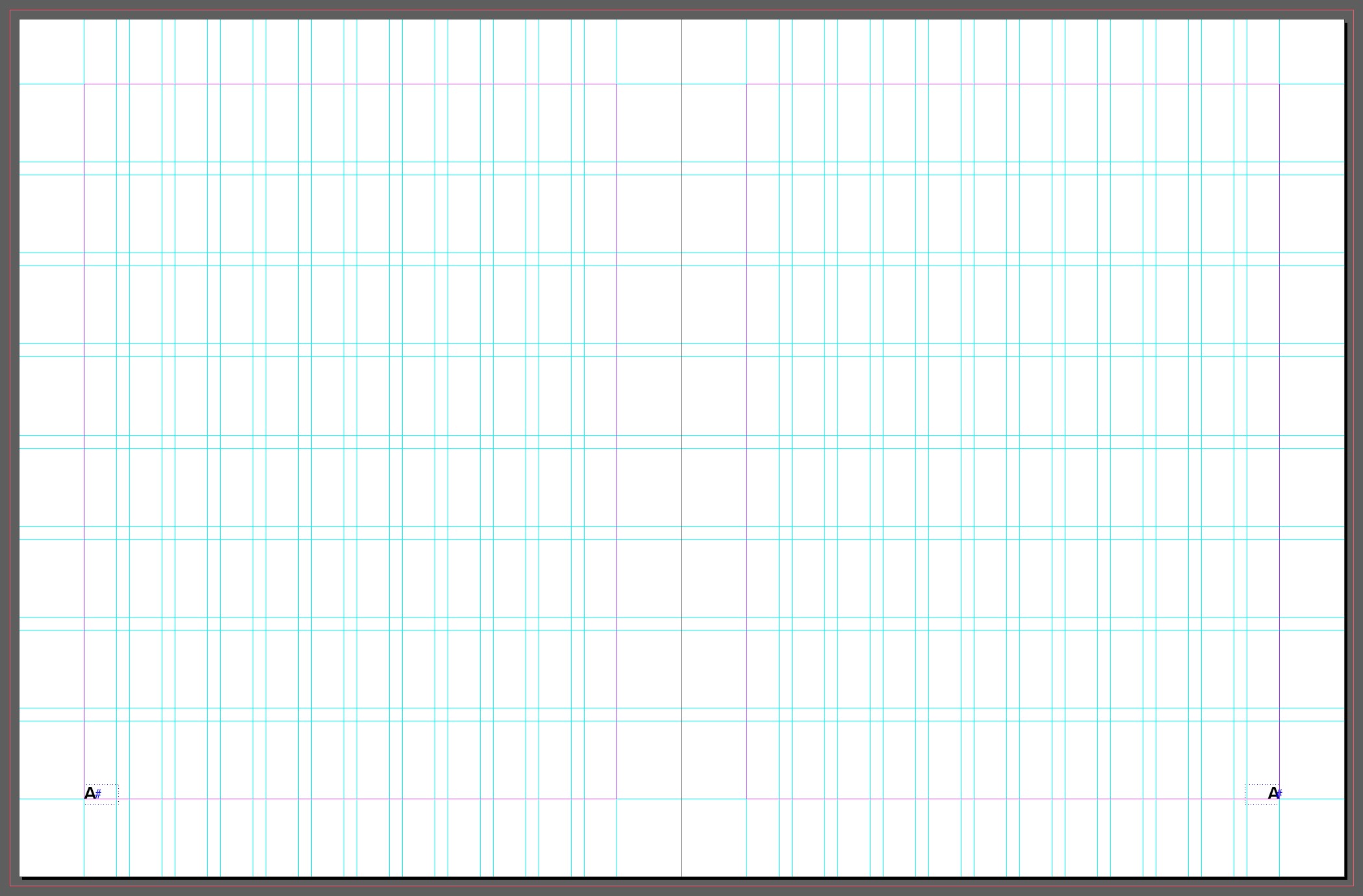
After setting up the modular grid, I added the first text to the magazine to create a baseline grid that would complement the layout grid. Originally I had a baseline grid with 12-points-increments. It didn't work with the pull quotes within the flow of the text. Eventually, I changed it to 3-points-increments, which worked better:
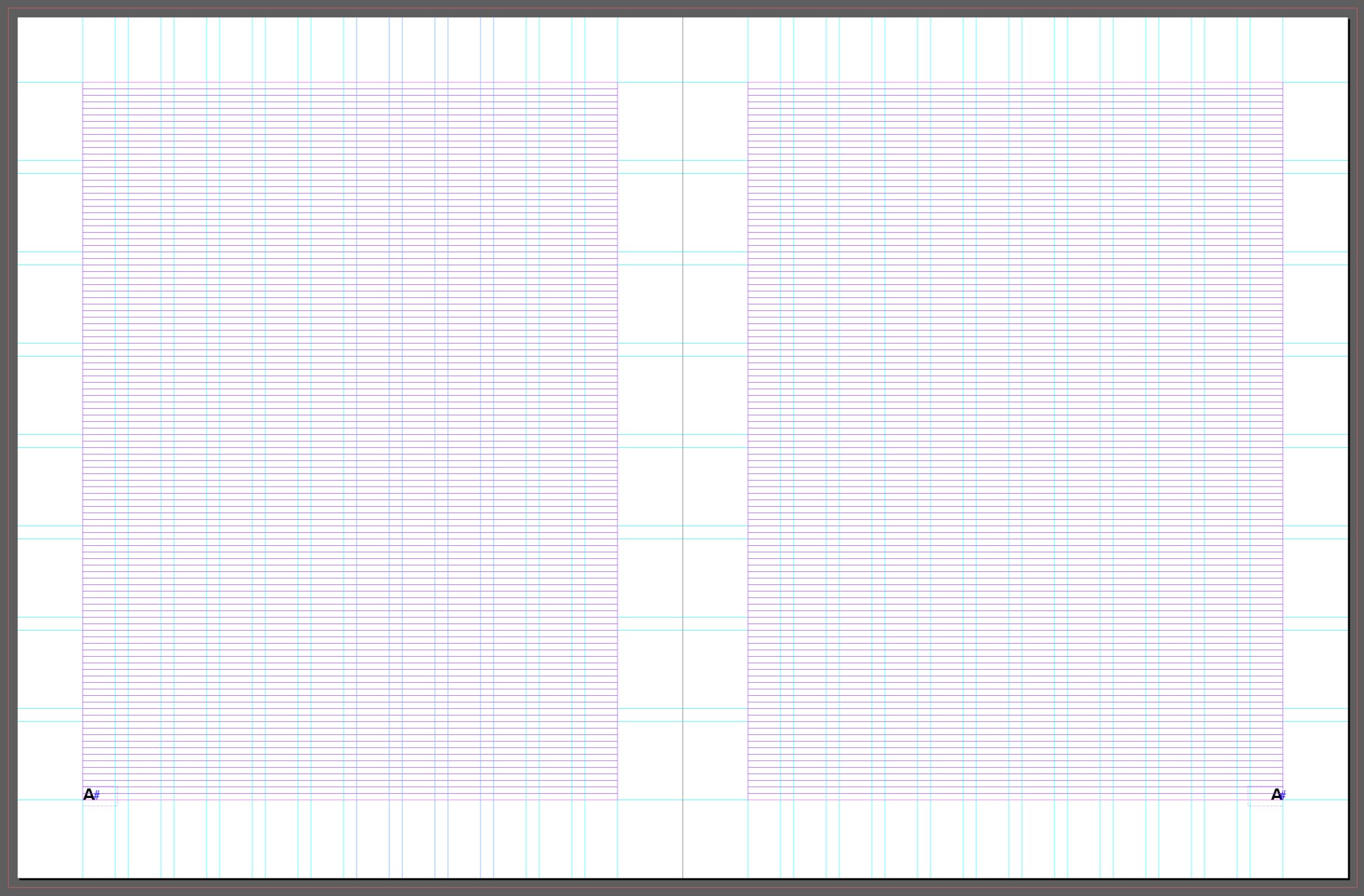
At last, I added simple page numbers and left a bit more margin at the bottom of the magazine than anywhere else.
Challenge Three - Finding Inspiration
Admittingly, I don't own nor am I subscribed to any haptic magazines. I primarily relied on digital versions of print magazines. I turned to Behance for inspiration in developing a solid concept for the magazine's visual identity. Here are four mood boards that guided each page design:
The Final Design
Design Justification
The Meeting with the Goddess
The ultimate adventure, when all the barriers and ogres have been overcome, is commonly represented as a mystical marriage of the triumphant hero-soul with the Queen Goddess of the World. — Joseph Campbell
Finding the Queen Goddess in the metaphor is finding, agreeing, and deciding on a final visual identity of the magazine for this case story.
The Style and Genre
The final design ought to be a modern semi-minimal visual identity that focuses on the content and aims to inform, empower, and ignite sustainable sentiments within the reader. In an ideal scenario, the reader shall then take the information to heart, want to learn more about a specific topic, and optimally tell and help others understand. These are ambitious goals for a magazine, hoping for a snowball effect in convincing more and more readers.
I approached these goals with a no-bullshit concept. The Eleventh Hour Magazine tells the reader that it's time to turn the tide and that we must act before it's too late. The reader opens the magazine with a sense of urgency, hoping to find the solution inside. The content then educates the reader with facts and good stories. In this way, the magazine provides the reader with a tool to help. Knowledge is king.
To achieve this, I created a modular grid. This flexible grid allowed me to make a good rhythm between cover pages, a table of content, six articles, and striking imagery. These images try to reflect the concept of urgency and repairing something broken.
Imagery
A few ideas went into choosing the right images for the magazine. I relied heavily on stock photography. I manipulated a few photos to align them with the raw concept and the colors and to immerse them into the layout so that it becomes a unit with the copy.
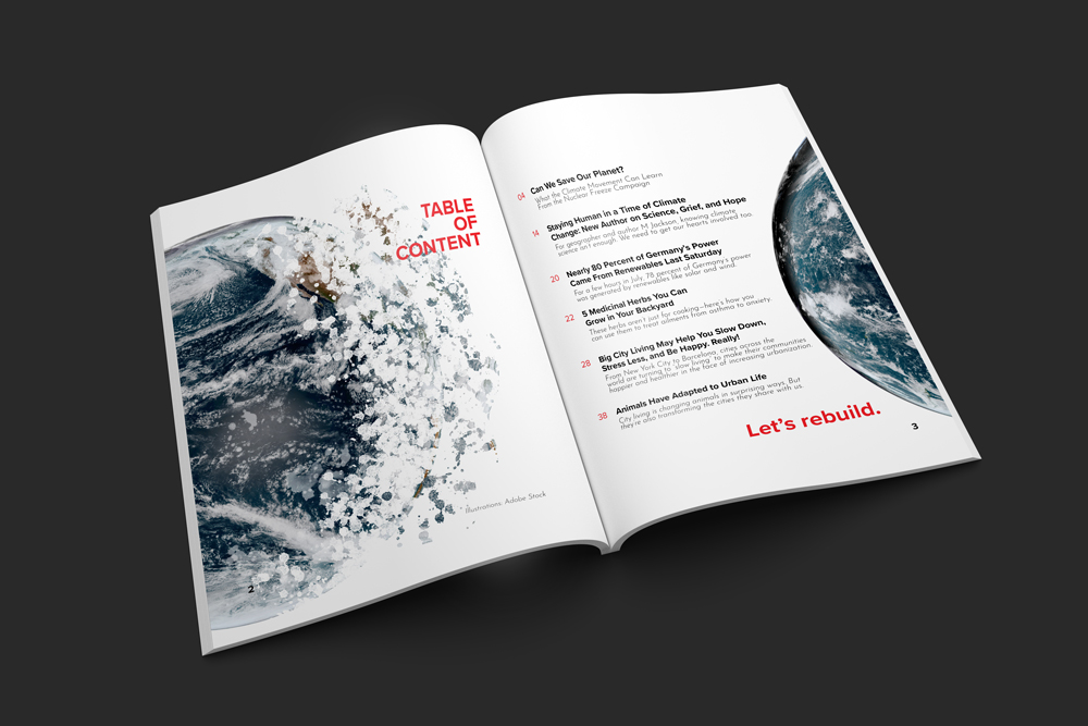
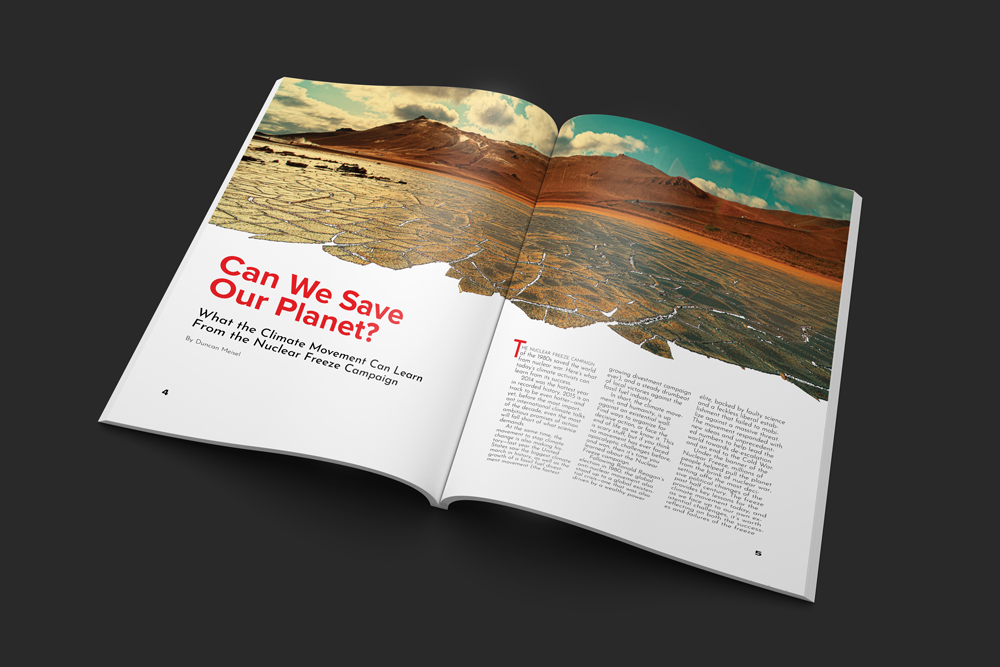
The images are primarily realistic, but I opted for some dystopian manipulations to integrate a few photos into the layout to keep a good rhythm in the magazine. I re-used the graininess and raw feel of the cover page a bit more throughout the magazine. The cover page sets the tone for the look and feel of the magazine.
Apart from that, I choose the images according to the body copy while keeping everything aligned with the visual identity. I kept playing with the visuals throughout the magazine to stay engaging and rhythmic. I opted for herb images with "no background" for the herbs article to calm the layout. The contrast between content-heavy pages and very minimal pagination does just that:
COLORS
The primary color is a piercing red that grabs attention without mercy. Initially, I used a more muted version. Both worked well, but I finally opted for the more robust and potent red. It also supported the readability of the logo on the cover page in front of the dark blue image. I contrasted the red with colder temperature images throughout the magazine: blue and green. I chose pictures with more warmth when it made sense. And I used white space wherever appropriate to break up the otherwise information-loaded content.
TYPOGRAPHY
In support of the visual strategy, I chose two very clean typefaces. Proxima Nova bold is in use for all headlines. Josefin Sans is in use for the body copy. For the pull quotes and the subtitles, I used Josefin Sans Italics. The two different typeface families work very well together. I created a straightforward hierarchy with the red color and different weights, styles, and sizes.
VISUAL HIERARCHY
A few more notes on hierarchy: I opted for some contrast between the article titles, imagery, and text. The article titles reserve visual dominance with their sixty-point size and piercing red color. Together with the italicized subtitles and the author names below, the titles make up an optical unit. The red pull quotes and drop caps keep the magazine engaging. And the images are trying to balance the layout.
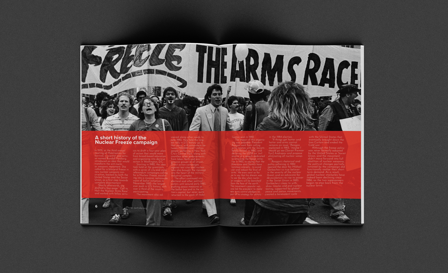
When there were content pieces like the history of the Nuclear Freeze campaign or the city article, later in the magazine, they received special treatment with a red box and white typography.